
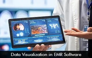
EMR Software technology has not only digitized patient data or have streamlined workflows but also empowers providers and care teams by turning raw data into actionable insights. Data visualization tools are modules inside the EHR System that provide a visual representation in the form of charts, graphs, and dashboards that can transform clinical, operations, or population health data.
Different Types of Data Visualization Tools in EMR Software
Data visualization tools are a great way to offer healthcare teams to get useful insights and can reap practical benefits. Major Electronic Medical Records (EMR) Software vendors like athenahealth EMR Software and Epic Systems offer data visualization tools for population health, clinical analytics, and financial and operational metrics.
Interactive EMR Systems Dashboards
The EHR Software dashboards give a snapshot of critical details by aggregating critical data and KPIs. This helps users get into the details of particular information that is required.
Heat Maps and Color-Coded Visualizations
These visualizations in the EMR Software are very useful for helping clinicians spot populations that are at risk and analyze disease spread. Especially helpful for public health specialists to watch out for trends, and keep a proactive approach in public health policies.
Reports and Summary Visualization
Reports and summaries can be utilized for compliance, audits, billing, and performance tracking. The EHR System can generate detailed reports on financial and operational performance. These reports provide a window to look into untapped goals. AdvancedMD EMR Software offers quick report generation.
Real-Time Monitoring Dashboards
These robust dashboards are designed to integrate real-time data from remote patient monitoring devices. Healthcare providers can be informed about their patients’ vital signs around the clock. Therefore, any alarming situation can be highlighted, so quick action can be taken to improve health outcomes.
The Benefits of EMR Software Visualization Tools
One of the most obvious advantages of using visualization modules in Electronic Health Records (EHR) Software is that they enable users to make quick and informed decisions. With the visualization tools, users don’t have to go through the hassle of looking at long sets of data, as clinicians can visually spot trends.
The real-time dashboards display critical patient data and that keeps updating in real-time. Patient monitoring, hence, becomes simple, leading to improved patient care and safety levels. Moreover, efficient resource management can prevail with dashboards that track bed occupancy and patient flow, and resource utilization.
Hands-on public health drives can be initiated with heat-map features in the EMR Software. Public health specialists can see data clusters, areas of risk, and social determinants. Visualizing these data trends can enable better preventive care for healthier societies.
Emerging Trends in EMR Software Visualization
Some exciting developments are rolling out in EHR Software. Beyond standard visualization tools, these include longitudinal visualization, AI-propelled risk detection, and natural language query visualization.
New tools, like TrajVis, can track how diseases develop over long periods. Other platforms, such as ParcoursVis, are designed to manage patterns across entire populations’ health records.
Some systems let users ask questions and instantly get visual answers. All these compelling advances are helping to create a future where EMR Software data feels more natural, helps predict outcomes, and is easier for healthcare providers to use effectively.